Ever notice how some Instagram homes feel effortlessly polished, even before you spot the furniture details? It’s rarely about expensive pieces though. More often, it’s the invisible decisions doing the heavy lifting—color balance, texture control, and visual rhythm. When those fundamentals are right, even budget decor photographs like it belong in a curated feed. When they’re wrong, no amount of trendy buys can save space. That’s why so many homes look styled online but fall flat in real life.
This article looks at the core principles behind Instagram-worthy interiors, focusing on how color palettes, mood boards, and layering techniques create that scroll-stopping effect. By understanding these foundational rules first, you set yourself up to make smarter, more cohesive styling choices as the series continues.
Master the Core Principles of the Instagram Aesthetic
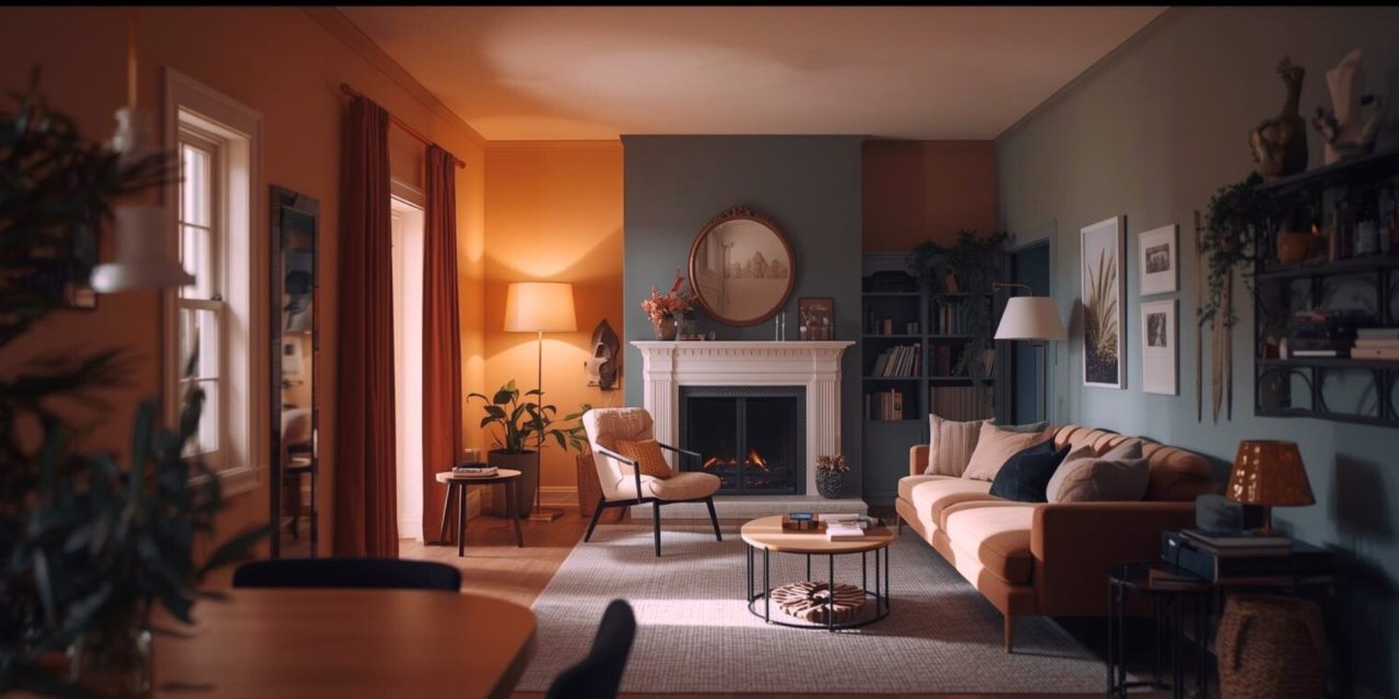
The most successful Instagram interiors follow a few repeatable rules. Influencers rarely decorate randomly. Instead, they work from a tight visual framework that keeps spaces cohesive, even when individual pieces are affordable or thrifted.
The first principle is consistency. When color palettes, materials, and finishes feel related, the room reads as expensive. The second is restraint. Fewer, better-placed items photograph far better than cluttered displays. Finally, contrast matters. Mixing soft and structured, matte and reflective, or organic and polished creates depth that stops a space from feeling flat.
Once these principles are in place, even budget decor—from IKEA finds to secondhand furniture—starts to look deliberate rather than improvised.
Color Palettes and Mood Boards That Anchor the Space
Strong Instagram interiors almost always start with a controlled color palette. Popular combinations like greige and sage, warm neutrals with brass, or terracotta paired with muted mustard work because they balance warmth with calm. These palettes photograph well and hide the visual noise that cheaper items can introduce.
Creating a simple mood board helps lock this in early. Pull inspiration images from Pinterest, drop them into a free Canva template, and note two main colors, one accent tone, and one metal or wood finish. This small step prevents impulse buys and keeps thrifted or budget pieces working together instead of competing.
When your palette is set, even inexpensive decor—like neutral cushions, ceramic vases, or wood-toned frames—feels intentional. The room stops looking “styled on sale” and starts looking styled with purpose.
Layering and Texture: The Budget Shortcut to Depth
Texture is the secret weapon of Instagram interiors. Smooth walls and flat furniture can feel cold or unfinished, especially on camera. Layering introduces visual softness and dimension without major spending.
A simple formula works consistently: start with one grounding piece like a rug, then layer throws, cushions in varied sizes, woven baskets, and greenery. Mixing textures—jute with faux fur, linen with ceramic, wood with metal—creates contrast that mimics high-end interiors.
This approach allows low-cost items to punch above their weight. A $20 throw layered over a thrifted blanket looks far more luxurious than either piece alone. Add a plant or a sculptural object, and the room suddenly feels styled rather than assembled.
Conclusion
Instagram-worthy homes aren’t built on endless budgets. They’re built on clarity, cohesion, and a strong understanding of how color and texture shape perception. When you control the palette and layer with intention, even modest spaces can feel polished, warm, and scroll-stopping.
Which small styling shift could instantly make your space feel more intentional instead of accidental?
Discover smarter and more decor strategies like this only on You’re In Style!


