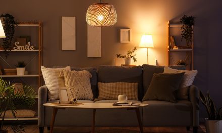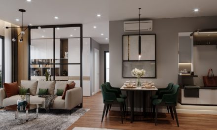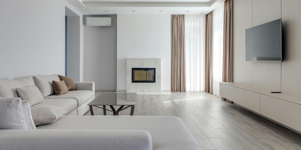
Neutral rooms are supposed to feel calm and timeless, but one wrong paint choice can turn the entire space into a very expensive-looking sigh. Suddenly the space feels less “calm luxury” and more “high-end dentist waiting room with trust issues.”
That is where color theory quietly changes everything. The best neutral spaces are not built around flat whites or lifeless grays. They rely on layered undertones, balanced contrast, and mid-tone shades that create warmth, depth, and personality without overwhelming the room. In modern interiors especially, neutrals work best when they feel soft, lived-in, and emotionally inviting rather than cold and overly polished.
Why Mid-Tone Neutrals Feel More Comfortable
One of the biggest mistakes in neutral design is assuming brighter always feels better.
Extremely stark whites with very high light reflectance can make spaces feel harsh, sterile, or visually exhausting, especially in homes trying to create warmth and comfort. Mid-tone neutrals usually create a softer atmosphere because they absorb more light while still keeping rooms airy.
That is why shades like Benjamin Moore Revere Pewter continue dominating modern interiors. With an LRV around 55, it reflects enough light to stay open while still adding warmth and dimension to kitchens, living rooms, and transitional spaces.
Warm neutrals with beige, greige, or taupe undertones also help spaces feel more relaxed and layered compared to cooler grays that can sometimes feel distant depending on lighting conditions.
And honestly, some gray paints only reveal their true personality after sunset… usually when it is too late and the entire room suddenly looks faintly haunted.
The Undertones Changing Everything
Undertones are what separate rich neutrals from flat ones.
Two gray paints may look nearly identical on a sample card, but once natural lighting enters the room, subtle undertones completely shift the mood. Warm grays pull beige or taupe. Cool grays lean blue or silver. Greiges sit somewhere beautifully in between.
The long-running debate between Sherwin-Williams Agreeable Gray and Repose Gray exists for exactly this reason.
Agreeable Gray carries warmer undertones that pair beautifully with wood furniture, earthy textures, and cozy living spaces. Repose Gray feels cooler and slightly cleaner, making it popular for bedrooms, minimalist interiors, and Scandinavian-inspired styling.
Lighting also matters heavily:
- North-facing rooms often benefit from warmer neutrals
- South-facing rooms can handle cooler tones more naturally
- Artificial lighting may amplify hidden undertones at night
- Layered textures soften cooler palettes dramatically
That balance prevents neutral spaces from feeling visually flat.
The 70/20/10 Formula That Makes Neutrals Feel Intentional
One reason professionally designed neutral rooms feel cohesive is because they balance tones strategically instead of using one color everywhere.
The 70/20/10 formula remains one of the easiest ways to build layered neutral palettes:
- 70% dominant neutral
- 20% secondary supporting tone
- 10% accent color or texture
For example, Agreeable Gray may dominate walls, Repose Gray could soften trim or cabinetry, while Revere Pewter appears through furniture, textiles, or accents. This creates visual movement without overwhelming simplicity.
The same principle works beautifully with:
- Linen fabrics
- Cream upholstery
- Jute textures
- Warm woods
- Stone finishes
- Matte black accents
- Soft metallics
These layers give neutral interiors their “soul” without relying on loud color palettes.
Because the best neutral rooms are rarely boring. They are just quietly doing excellent interior design work.
Conclusion
Neutral interiors become far more powerful when color theory guides the choices behind them. Through undertones, balanced light reflectance, layered textures, and thoughtful contrast, neutral palettes create warmth, sophistication, and emotional comfort instead of flat minimalism.
From greige walls and soft taupes to layered gray combinations, the right neutrals transform spaces into rooms that feel calm, timeless, and deeply lived-in.
Which neutral paint color completely changed how a room in your home felt once it was finally on the walls?
Keep exploring modern interiors, timeless palettes, and elevated home styling ideas with You’re In Style.