There is something oddly satisfying about a space that just feels right. You walk in, and suddenly everything looks more put together—even if nothing major actually changed. No new furniture, no dramatic overhaul… just a subtle shift that makes your home feel like it got its life together overnight.
That is the quiet power of color. A few intentional swaps can take your space from “still holding onto summer” to to “effortlessly in season” without draining your wallet—or your energy trying to redecorate everything at once.
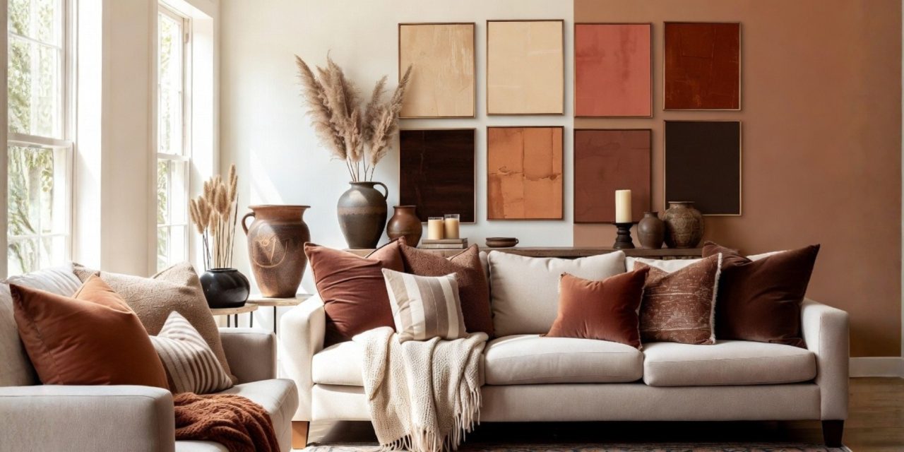
Color Palette Shifts That Actually Transform a Room
Seasonal color changes work best when they feel intentional, not random. A soft summer palette like #E8F4F8 naturally leans airy and light, while fall tones like #A8522D brings warmth and depth.
The easiest way to make this transition look polished is the 60-30-10 rule:
- 60% dominant color (walls, large furniture, rugs)
- 30% secondary color (curtains, bedding, chairs)
- 10% accent color (decor pieces, vases, art details)
This structure keeps your space balanced instead of overwhelming.
Color psychology quietly does a lot of heavy lifting here. Warmer tones tend to make a room feel cozy and grounded, while cooler tones feel open and calming. Even a simple switch—like changing pillow covers or adding a deeper-toned throw—can shift the entire vibe.
If you want a quick win, start with one focal point. An accent wall, a bold rug, or even a statement couch in your dominant shade sets the tone. From there, layer in supporting colors through smaller pieces.
Always test colors in natural light before committing. The same shade can look completely different depending on the time of day, and nothing ruins a vibe faster than a color that looked better in the store.
Seasonal Wall Art That Keeps Your Space Feeling New
Once your palette shifts, your wall art should follow. Otherwise, the room starts sending mixed signals—like wearing a winter coat with summer sandals.
Rotating 5–7 art pieces is enough to refresh a space without overdoing it. Using tools like Command Picture Hanging Strips keeps the process simple and damage-free, which means you are more likely to actually stick with it.
A clean gallery wall layout works best:
- 3×2 grid arrangement
- 2–3 inches spacing between pieces
- Mix of canvas prints and framed photos
Here is a simple seasonal guide to keep things cohesive:
| Season | Months | Palette (Hex Codes) | Art Direction |
| Winter | Jan–Mar | #F5F5F5, #A8D5BA, #4A4A4A | Minimal, snowy, soft contrast |
| Spring | Apr–Jun | #E8F4F8, #98D8C8, #F7DC6F | Florals, light textures |
| Summer | Jul–Sep | #FFE4B5, #87CEEB, #FF69B4 | Bright, beach-inspired |
| Fall | Oct–Dec | #A8522D, #D2B48C, #8B4513 | Earthy, abstract, warm tones |
The key is consistency. When your colors and art align, the space feels intentional—even if the changes were small.
Wrap Up
A home reset does not have to mean starting over. Sometimes, shifting your color palette and updating a few visual elements is enough to completely transform how a space feels. With the right balance, your home moves with the seasons instead of staying stuck in one mood all year.
What color shift would instantly change the mood of your space right now—something warm and cozy or light and refreshing?
Let us know in the comments, and keep refining your space with effortless style upgrades only at You’re In Style!


